Magazine Layout for Viola Site
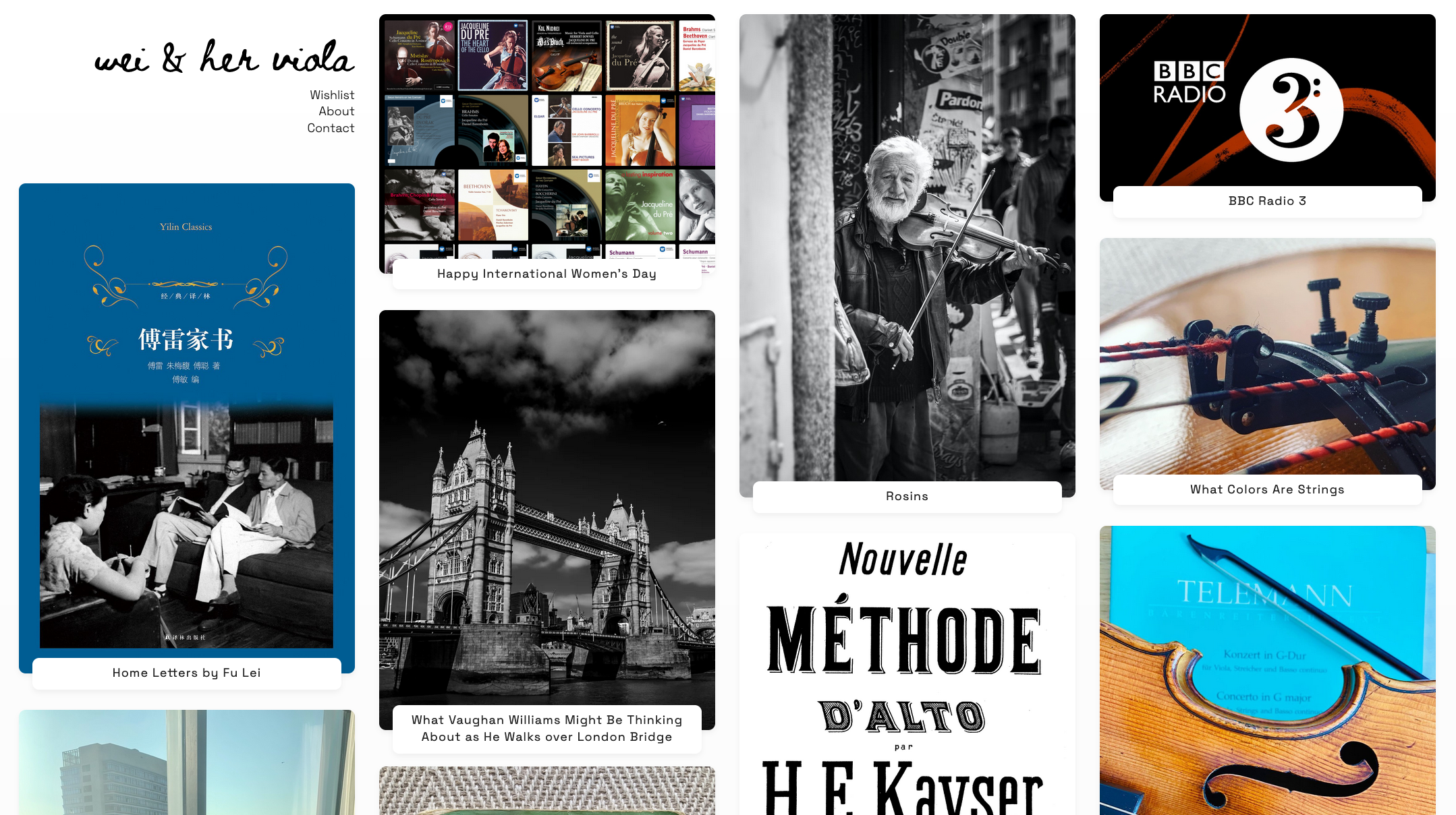
Recently I ran into this website Violins and Violinists and I immediately fell in love with its design, layout, and interactions. So I try to replicate the UI on my site for my hobby playing the viola - wei and her viola.
Violins and Violinists is visibly a site for an artist. Its site master self-identifies it as a magazine:
The occasional magazine of Benjamin Hebbert, Violin Dealer & Expert
The site features an astonishing layout that is rarely seen in platform-structured sites. Its list of articles streams down columnized. And when you hover on the card of an article, it kind of slides up as if some mystic force floats it up in the air upon your attention.

I thought this design is really cool and natural. And I want to replicate it in my own viola site, because the topic is fairly close and I really want to try multi-column layout for listing. I'm faily confident about the animation part because of a few recent build such as the flashing effect on this site I'm building with my friend Huijing. It's the multi-column layout that will be causing a bit hair pulling, as the browser spec for the multi-column layout does not allow elements to span certain number of columns, which is what is implemented in the original site (it's not using CSS multi-column). And the overall support of multi-column layout isn't great.
Hover animation
First I worked on the hover animation. The implementation on the original site uses BEM, which thankfully makes it very readable. The .card_wrap wraps the whole card, where a .card__hover wraps around the same children and carries the hover event. Then the .card__hover:hover pseudo-selector will be used to target covered children for their respective animations.
Take a look at the original animation behavior. I see it as two parts. First, the image is shifted upper left, leaving a shadow behind. Second, the title box is lifted upper left but mainly up, the left component only to match the image's displacement. And some extra content is displayed inside the title box.

The original animation implementation is what in my opinion a bit overly complex. It implements a pseudo-element for the shadow, which is by default translated bottom-right, and this transformation is removed upon hover. The remaining of the card translates upper-left when hovering. And because of this offset transformation, the title box is transferred directly up. So altogether it has 3 things that are moving during the transform: the image, the title box, and the shadow.
Also worth mentioning in its original implementation is the use of will-change. This is a CSS property to hint browsers how an element is expected to change. It is intended to improve performance and responsiveness, but actual usage can be tricky, see here.
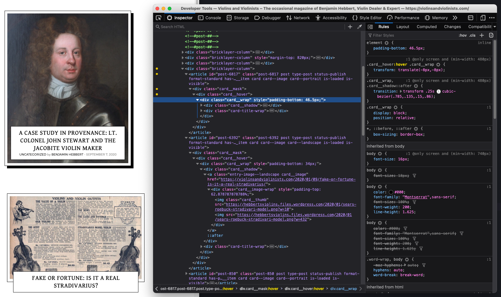
I've taken a simpler approach (I think). Instead of using a pseudo-element for the shadow, I make the card wrapper black in background and that stays stable. When hover happens, I have two transformations only, corresponding to the two animations. I translate the image and the title box upper left together, with their respective dislocation. Here's my DOM structure, without adding the further detail yet, I have only one element each for the image and the title only, and I'm not using a pseudo-element.
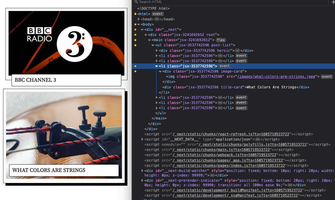
As to the animation CSS, here are the two transforms:
li:hover > .image-card {
  transform: translate(-8px, -8px);
}
li:hover > .title-card {
  transform: translate(-8px, calc(-50% - 30px));
}
I copied the transition function from the original implentation directly. But if you are interested in understanding Bézier Curves better, I have a talk earlier The Obscurities of Bézier Curves Explained to My Computer Engineer Friends at SingaporeCSS #52.
li > .image-card,
li > .title-card {
  transform 0.25s cubic-bezier(0.785,0.135,0.15,0.86)
}
And here's how it looks (without the detail info, for now):

Refine title box layout
Some refinement work here at the title box.
In the magazine site, the title box reveals a bit further information when hovered such as category, author and date. I have a similar information structure, except that all posts are written by myself, so I can leave out author and save some space.
I've pretty much reused all the styling here, with a little bit of eyeballing the colors. Relevant here is that I decided to keep using my previous font – I like its classy touch. I've added a 1.1px letter spacing here because it looks more comfortable with a little bit more space between the letters. Text rendering is a magic in browsers. It's the only case where even a .1px will visibly make a huge difference.

I've also updated the styling here to place the title box more precisely 50% sitting on the bottom of the card. Once again I think my implementation is arguably more performant here. The problem is that we don't know how tall the title box will be. If the title is very long, then the box can grow quite tall. So we can't tell the browser in advance how much below the bottom line the box should go. I'm using a CSS solution here, namely translateY(50%). translate is one CSS property that won't cause browser reflow, so that's very good for performance. And it kind of acts like it'll move the element after it's already been placed on the screen, so the browser knows how wide or tall the element is already.

The more interesting part is the animation of the detail info. I had a naïve solution as well. But this time not as great as the original site. My solution was to set display: none to hide the extra row when not hovering, and reveal it when hovering. The opacity part is the same. The problem is with the transition from display: none to display: block causing an instant jump of the height of the title box. This is because you can't give it a timing function as "to display or not" is not a measurable dimension that can be stretched over time.
To describe the "appearing" animation more specifically, what we do is a combination of change in transparency and growth of the box height. Initially, we set zero transparency and negative margin to hide the element. The negative margin is such that the element is "retrieved" a little bit so that the box is shorter. This doesn't matter because it has zero opacity and is therefore invisible. When hover, we change opacity to completely opaque and remove the negative margin to unhide it and move it in place. Both the change in height and opacity can be parametrized and therefore we can see a growth in the title box height and the text to appear from transparent. If I uncheck the opacity change, you can see the card height mechanism here:

Trying CSS Multi-Column Layout
Layout is one topic that I mostly only took the idea of what's in the original site, but implemented more according to my own need and exploration. This is because:
First, I want to learn about CSS Multi-Column Layout. This is one of the more recent CSS layout specifications that describes how browsers should render fractional block formatting context for the multiple columns. It also feels to me that this design fits exactly the intended use case for the specification. So, I'm wondering if the actual design is doable with this.
On the flip side, the original site didn't use such a new specification, even though the use case seems to be matching. After all, word press serves 35% of the websites in the world (data as of Nov 2020), they have to be production ready.
Elements can only either span full columns or stay within their own columns, they cannot partially span the layout
But more specifically, after attempting my design of a similar concept, I also realize that the design of the original website cannot be fully implemented solely with the multi-col specification – at least not without quite a bit of non-trivial facilitation of other techniques. Here is the main problem:
The multi-col spec doesn't allow elements to span certain number of columns, you can either span all columns, or stay within your own column, you can't span only 2 out of 4 columns, as is shown in the original layout:
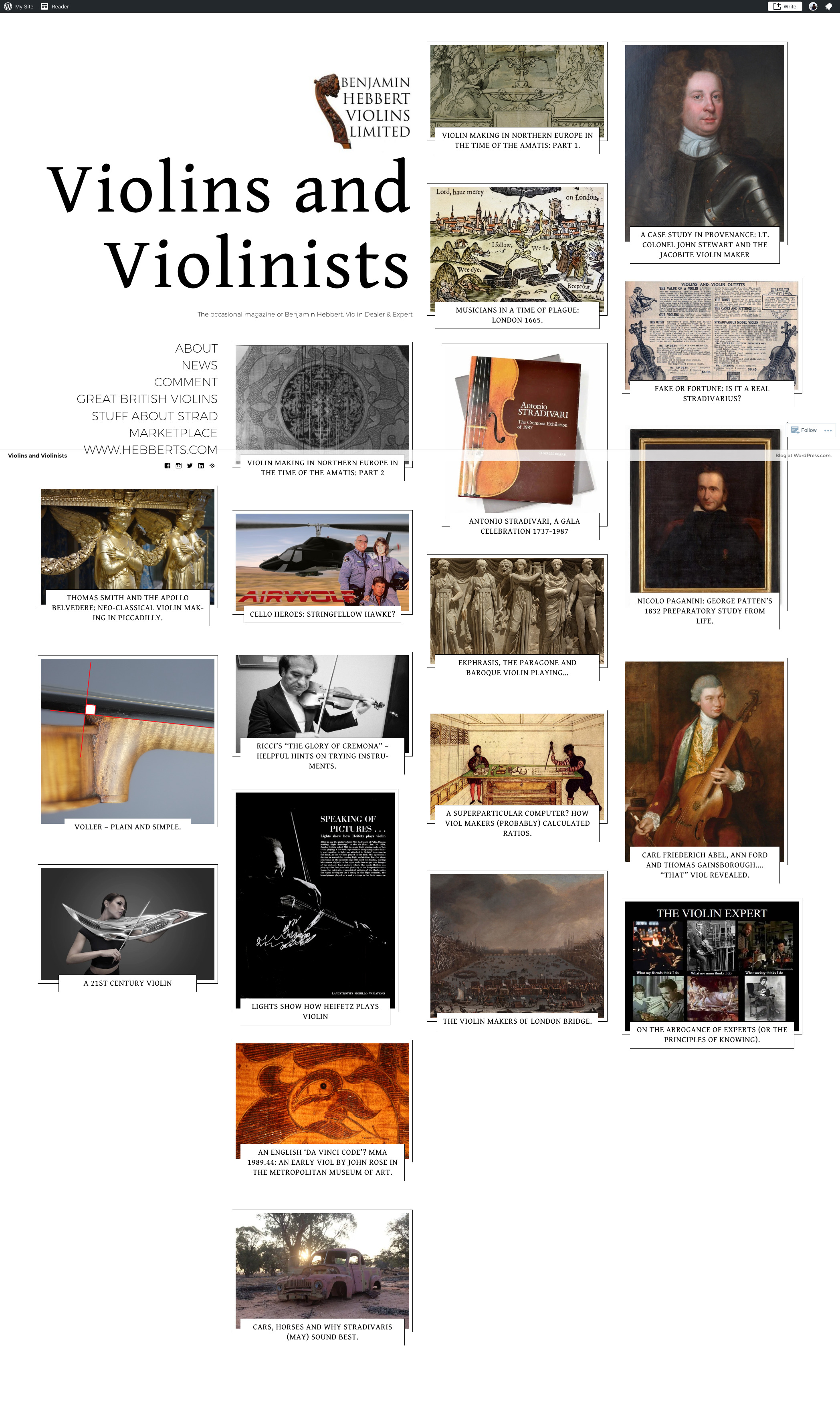
You can see that the heroic element (the heading, with some links and logo) spans exactly 2 columns of the 4-column layout. The original site styled this rather manually.
Regarding this issue, Rachel Andrew has an article When and How to Use CSS Multi-Column Layout where she mixed-and-matched grid and multi-col to implement this. But this is still not optimal in my opinion, because this requires that I programmably fill the markup (i.e., half goes to the grid, half goes to the multi-col node).
So, in my site, I stll use the multi-col spec, but I leave out the 2-column span of the heroic element. It spans one column only. I've intentionally given the left side a bit more space so there's some asymmetry here.
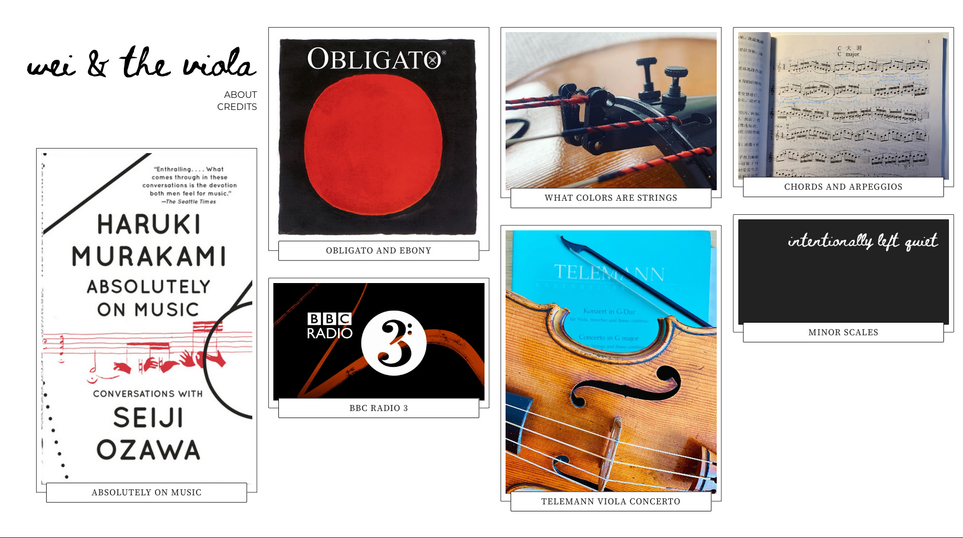
Columns cannot have different widths
This issue is not relevant in the original design, but rather a thought inspired from paper media multi-column layout design. I notice that many magazines' or newspapers' multi-column designs have unequal column widths. When it's laid out properly, it's so natural you might not even notice it. So I thought it would be a common feature to consider when we parallel this in browsers, especially considering such flexibility is available in CSS Flex Box and CSS Grid, which we consider as "modern CSS layout tools".
Update: Feb 22 2022 with new look of the site:
